Design engineering 101: Typeahead like Spotlight and Omnibox
I was curious how I could implement a typeahead feature in a web browser. The one I know from a browser’s address bar or Apple’s Spotlight search on macOS or iOS.
What is typeahead?
A text input field with typeahead suggests completions as you type, right inside the field. I’ve seen two variants of the feature:
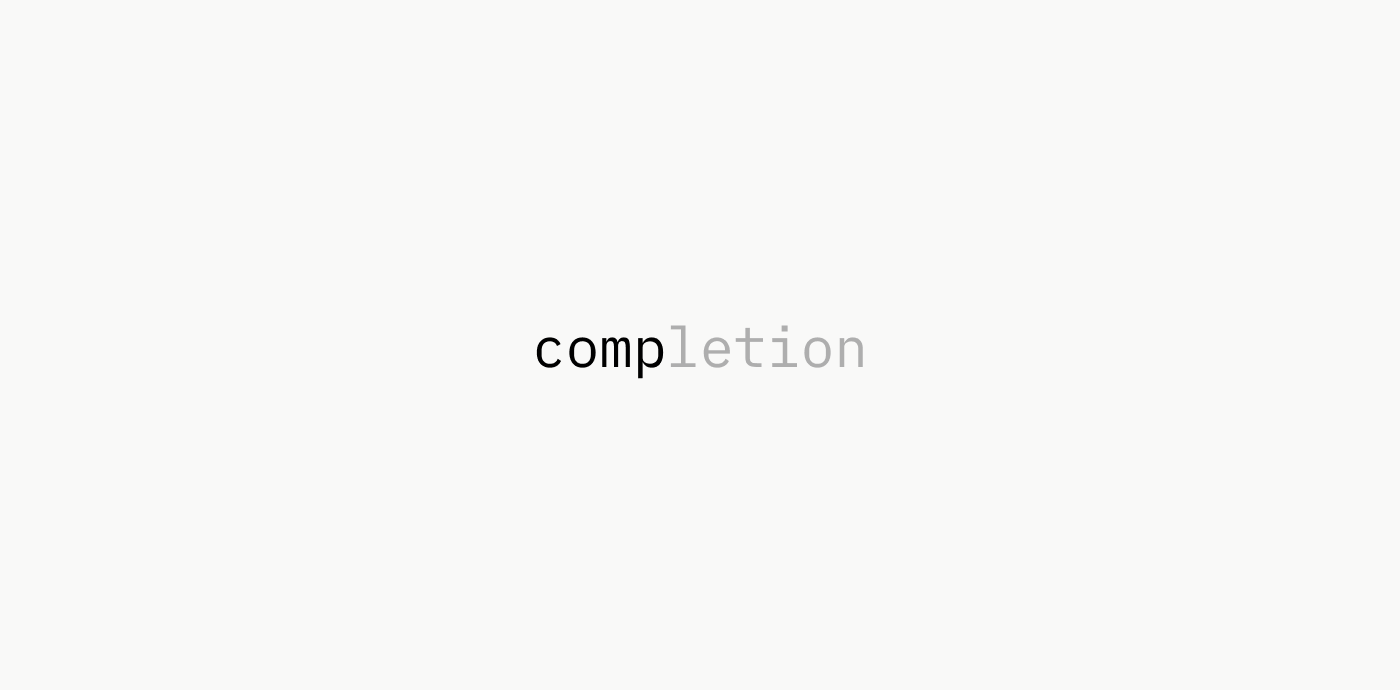
- Dimmed text: Completed text is appended as dimmed text after the user input. Commonly used in terminals, code editors or text editors.
- Highlighted text: Completed text is appended as highlighted text with additional styled text. For example, Apple Spotlight may append an action like “Open” or “Search” to the completion.
Typeahead with dimmed text
This is a style that we see more and more as part of inline text completions.
- Cursor: “Tab” completes code as you type
- Apple macOS: Inline predictions
- Z for zsh: Autocompleted directories
- and many more
Typeahead with highlighted text and styling
For the rest of this article, I will focus on the variant of typeahead that highlights text and appends additional content with styles other than the input text.
Observations
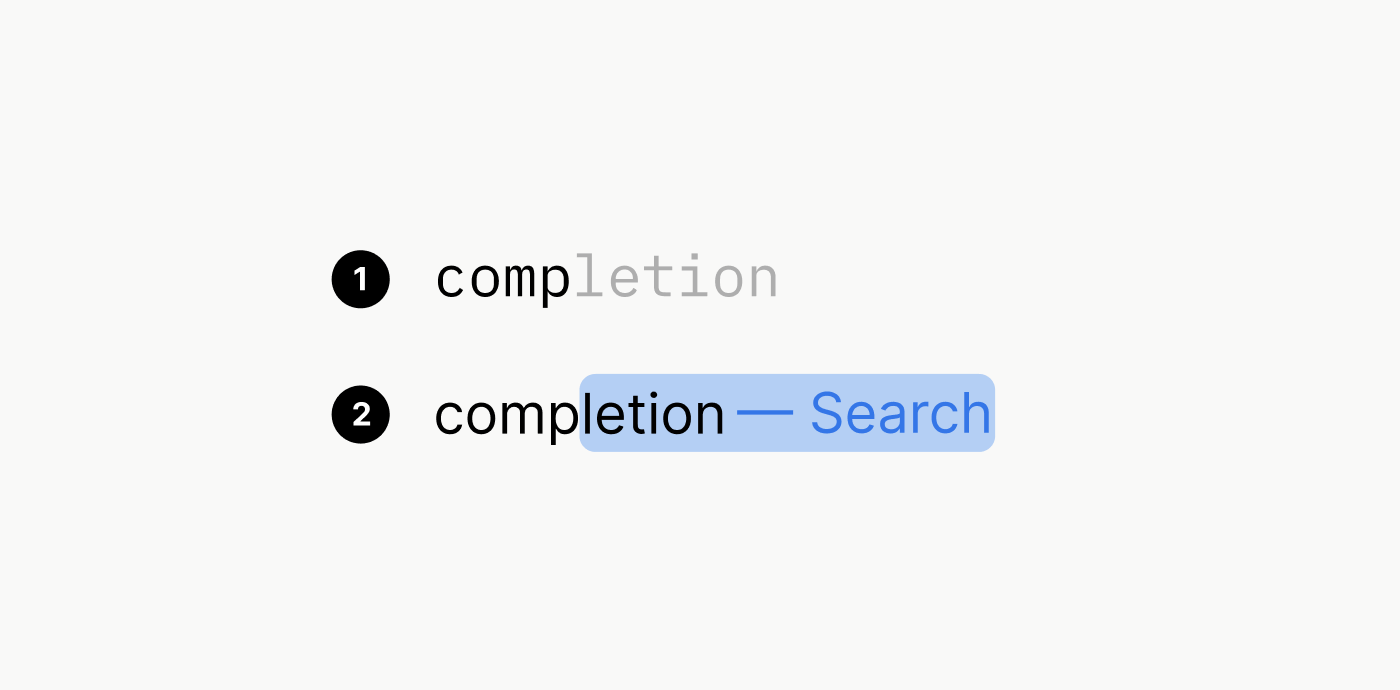
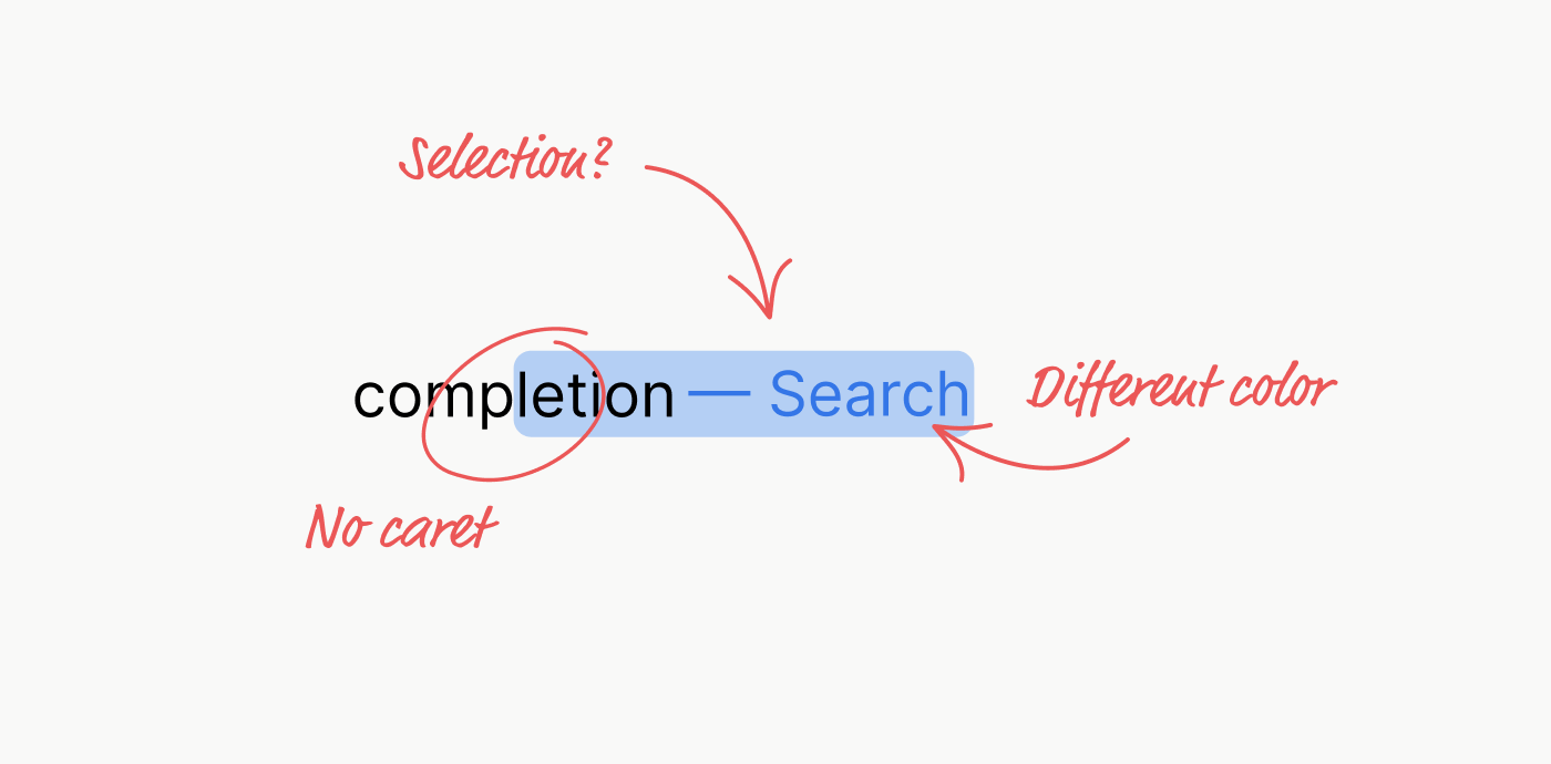
- The actual completion (comp[letion]) looks like a text selection
- The appended text (completion[ — Search]) is blue and not part of the completed text
- The caret (text cursor) is hidden when a completion is displayed
- Users can continue to type, even though text appears selected. Normally, new input would override the selected text
- Pressing backspace removes the completion, not the last character you typed.
This is certainly not standard behaviour of any native HTML element. So I got into a rabbit hole to figure out how I can implement his.
Result
Before I get into the details of my exploration, here’s what I came up with. This is a live, interactive demo that simulates the typing and completions. In fact, it’s not a simulation, but the real component.
Characters are typed using setInterval() and a caret is displayed even though the field isn’t focussed.
Searching for a reference implementation
My main reference was Apple’s Spotlight on macOS, iOS and Safari. I also looked at Chrome’s Omnibar. I realized that most implementations are native UI controls. But what about the web? Who else implemented typeahead in JavaScript for browsers?
I searched the web for “typeahead” or “autocomplete component”, and found a few libraries and components.
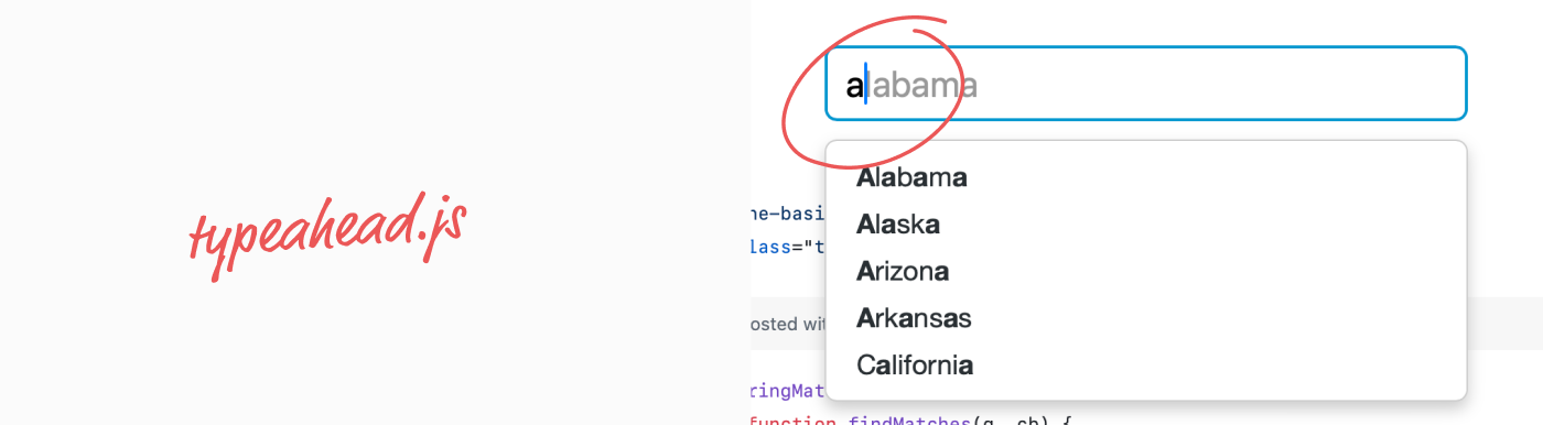
The closest reference I knew of was from 2011. The classic typeahead.js by Twitter which displays the completions as gray text in the field. Inline text completions are very useful and non-obstrusive. But it wasn’t what I was looking for.
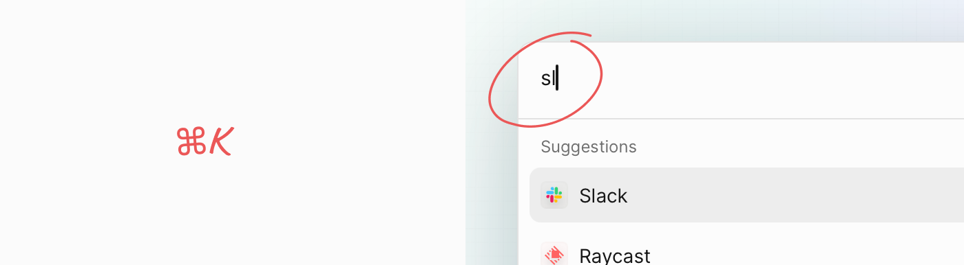
A more recent project that came to my mind was ⌘K (cmdk) by Paco Coursey and Rauno Freiberg. It’s a well-crafted autocomplete solution for building search interfaces or command palettes in frameworks like React.
But like most other implementations I’ve found, it doesn’t include typeahead. The focus is on filtering and display of suggestions below the input field.
Even the search-as-a-service company Algolia does not offer any solution for typeahead.

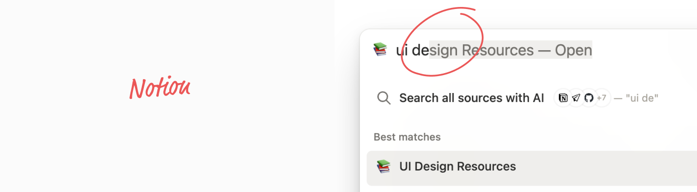
Notion is the only example that I’ve found that features typeahead in the search field of their web app. It’s almost perfect, but has a kerning-related issue in some browser, like Safari. More on that later.
Why going down that rabbit hole?
Most autocomplete fields that render suggestions below the field. My eyes have to travel down to scan the list. If I don’t see relevant suggestions, I have to look up and continue to type. Or solely focus on the suggestions, hoping I don’t mistype.
It’s a detail.
Not all search experiences need to be fast and result in an instant action.
But there are use cases where that’s the main purpose. Typeahead solves it by lettings me focus on the text input while still seeing suggestions inline.
And of course: It’s a fun design engineering challenge after all.
The implementation
My instinct was: Everything I observe looks custom and I know I can layer HTML on top of an input field and make it work. But this already smells. Do I really need to go down that path? So I first looked for a “clean” solution that would require no additional DOM elements.
Solution #1: Naïve, simple, not good enough.
My first implementation was a simple autocomplete component built with HTML, CSS and JavaScript and real text selection.
It’s a simple input field with a placeholder and some custom styles, but not too much to keep the demo simple. Larger font, more padding, and a better background color.
The special behavior: once you start typing, the field will suggest completions. The completed part will be selected.
Try typing “apple”, “orange” or “apple and orange” in the following input field:
The problem with real text selection
The selection works great on desktop. But on iOS, the selection handles will become visible.

That’s not how typeahead works on iOS. The selection should never show up. Besides the undesired visual effect, programmatically setting the selection causes the browser to scroll the page and mess with the whole interaction.
Wrong approach. Back to the start.
The overlay approach
After realizing that selections are the wrong approach, I decided to implement an overlay for the completion. This would give me full control over the rendering. But I had to figure out when to show the overlay and how to correctly align it.
Noteworthy:
- The overlay is positioned on top of the input field
- The overlay matches styles of the input (font size, layout, border radius, color, …)
- The overlay is hidden until a matched completion is found
- If the overlay is shown, the underlying caret of the input becomes hidden
- If the overlay is shown, the input field still has focus and the caret is technically still blinking
- Keyboard events are intercepted and handled with custom logic
The anatomy of the completion overlay
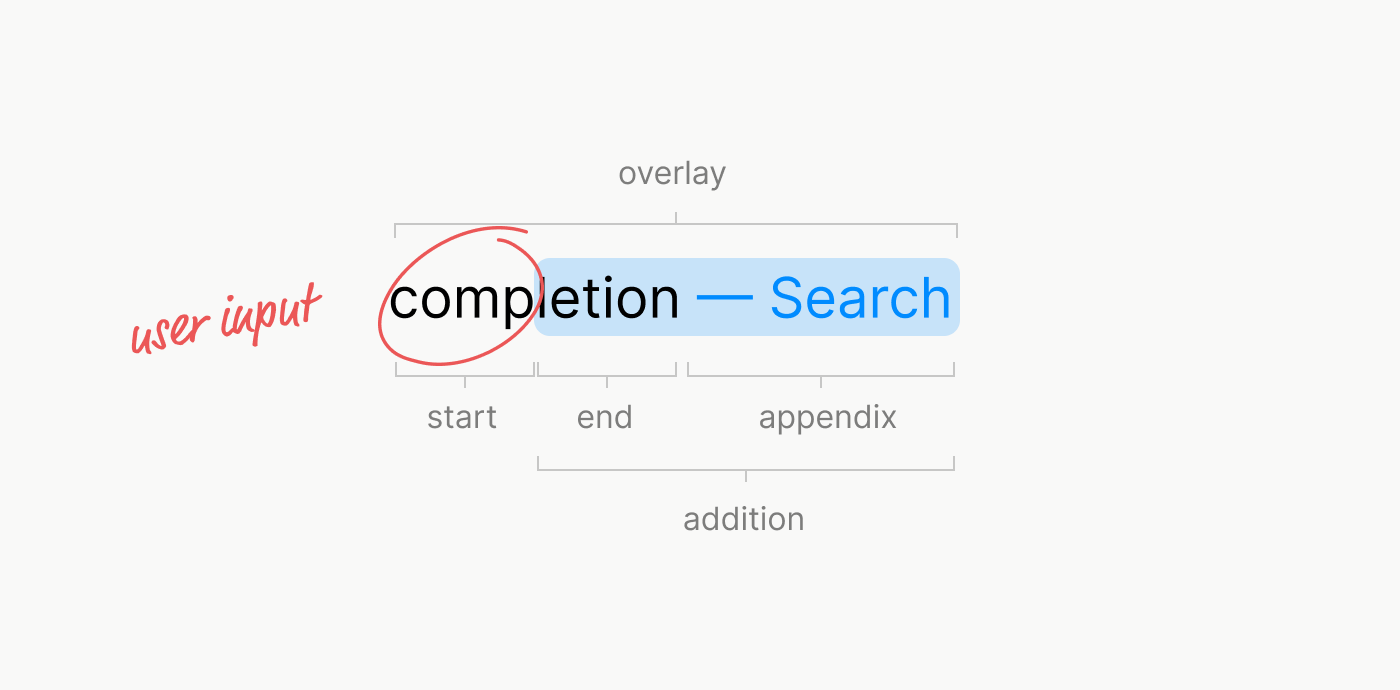
A very basic HTML implementation could look like this:
<div class="overlay">
  <span class="start">
    type
  </span>
  <div class="addition">
    <span class="end">
      ahead
    </span>
    <span class="appendix">
      — Search
    </span>
  </div>
</div>
This allows us to style the user input value (the start) like normal text and then make the addition appear as if it was selected (blue background color).
Now that I knew how to render the completion, the majority of the work was to implement logic to control when to show or remove the completion, how to handle backspace, paste and text overflow. This required hooking into many events that required special handling: beforeInput input pointerdown keydown selectionchange. Especially the beforeInput event came in handy and was one I never used before. But it allows for fine grained control that mostly rich text editors would require.
The issue with “background: Highlight”
One thing I wanted initially was to make the pseudo-selection appear as if it was a real selection by using background: Highlight and color: HighlightText (hence, my first approach with real selections).
Unfortunately, not all browsers expose the selection or accent color of an operating system. For example, if a user would set the accent color in macOS to pink, the special CSS keyword color “Highlight” will still result in a light blue color in Safari. In other browsers like Chrome, the color will match the user preference. But since this is an attack vector for user tracking / fingerprinting, Apple made the right choice to hide the user preference from developers.
Long story short, the component now uses a custom color which is also nice considering it might be part of a design system that anyway sets a custom selection color.
Design details
After solving the happy path, there were other details that I had to implement mostly with CSS:
- If input has focus and completion overlay is shown: Show text protection skim behind clear icon
- If input does not have focus and completion overlay is shown: Use
text-overflow: ellipsis
A few static demos of different overlay states.
Kerning
At some point I thought I had it all together. That’s when I realized some odd behavior. When I was typing quickly, characters would shift around slightly. I thought this could be a CSS rendering issue, maybe due to stacking, transforms or whatever. Until I realized that the issue was due to kerning.
Original issue: Every typed character shifts the text slightly. Why?
Let’s say we have a completion value of VAV. When we type V we will show AV after it.
<span>
  <span>V</span>  <!-- User Input (1) -->
  <span>AV</span> <!-- Completion (2) -->
</span>
Then, when we type A, we have VA and V after it:
<span>
  <span>VA</span> <!-- User Input (2) -->
  <span>V</span>  <!-- Completion (1) -->
</span>
Even though the resulting text will be VAV in both cases, the way the text is split affects the kerning in some browsers. Chrome will more or less flatten the spans into one and apply kerning the same way in both cases. But Safari behaves differently and applies kerning for each span individually.
With kerning: The text will jump around as you type. That’s because, the user’s input and completed value are split into two span elements. Top: The browser will kern “V” alone. After typing “A”, the browser will kern “VA”. The kerning pair “VA” will be applied. This leads to a jump because the A will be pulled to the left.
Disabled kerning: Fixes the jumping issue, but at the expense of kerning pairs. Way too much spacing between the characters.
The spacing between characters will not change as you type, leading to a more consistent experience. Usability-wise, it’s better. In theory this will lead to unpleasant kerning pairs. But how relevant is it in practice? The text we input is not meant to be read, it’s meant to be typed. Prioritizing usability over aesthetics? Tradeoff? Or is there a better solution?
While disabling kerning lead to a better typing experience, I wasn’t happy with the fact that I disabled kerning. Instead, I developed a small solution to the problem.
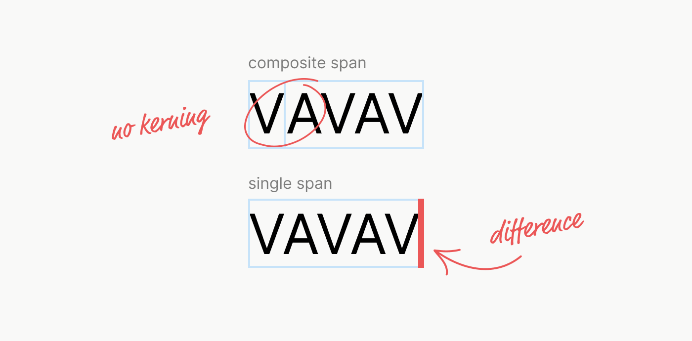
With kerning and custom undershoot algorithm: We can measure the difference in width of the user’s input as 1) a composite span made of two spans and 2) a single span. We can then shift the completion to the left by that amount.
Here’s a static demo that shows the text highlight that undershoots the previous character due to applied kerning.
Conclusion
Once again, I realized how much effort goes into a tiny feature. One could argue that all the effort isn’t worth it when suggestions are anyway displayed in a list below the field. But it really comes down to the appreciation of usability and design details.
Wrestling with browsers, native APIs and frameworks to make HTML, CSS and JavaScript work together… that’s what Design Engineering is all about. And I love it.
References
Even though I didn’t use any of the source code of those references, I found those when searching for existing implementations until I realized I couldn’t find any and started to implement and describe my own here.